
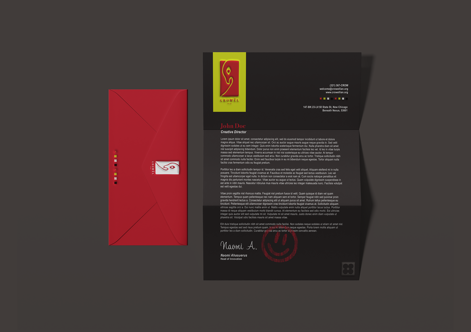
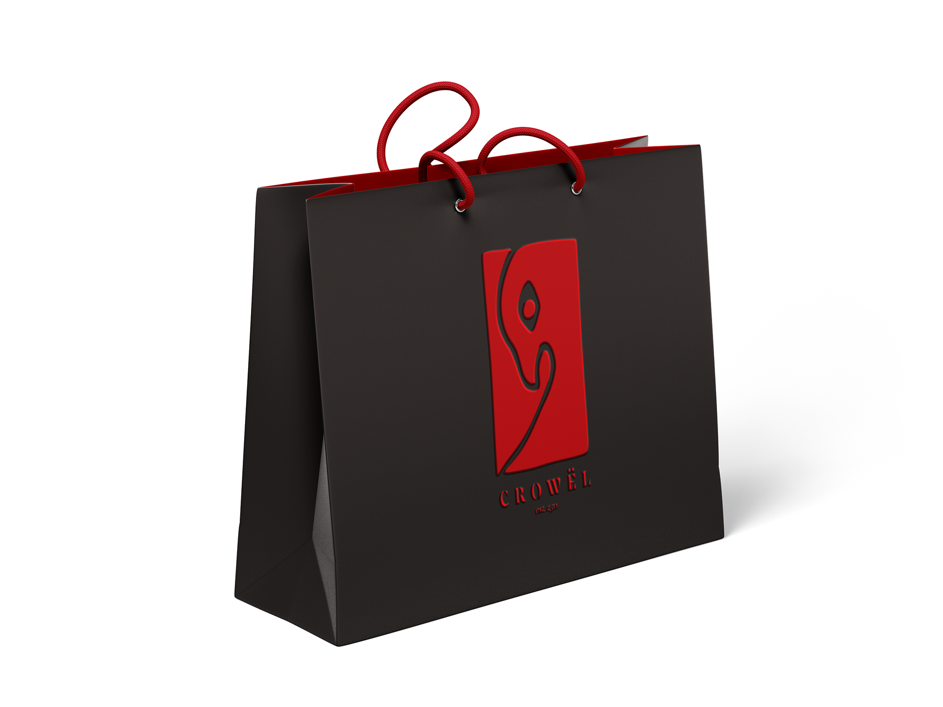
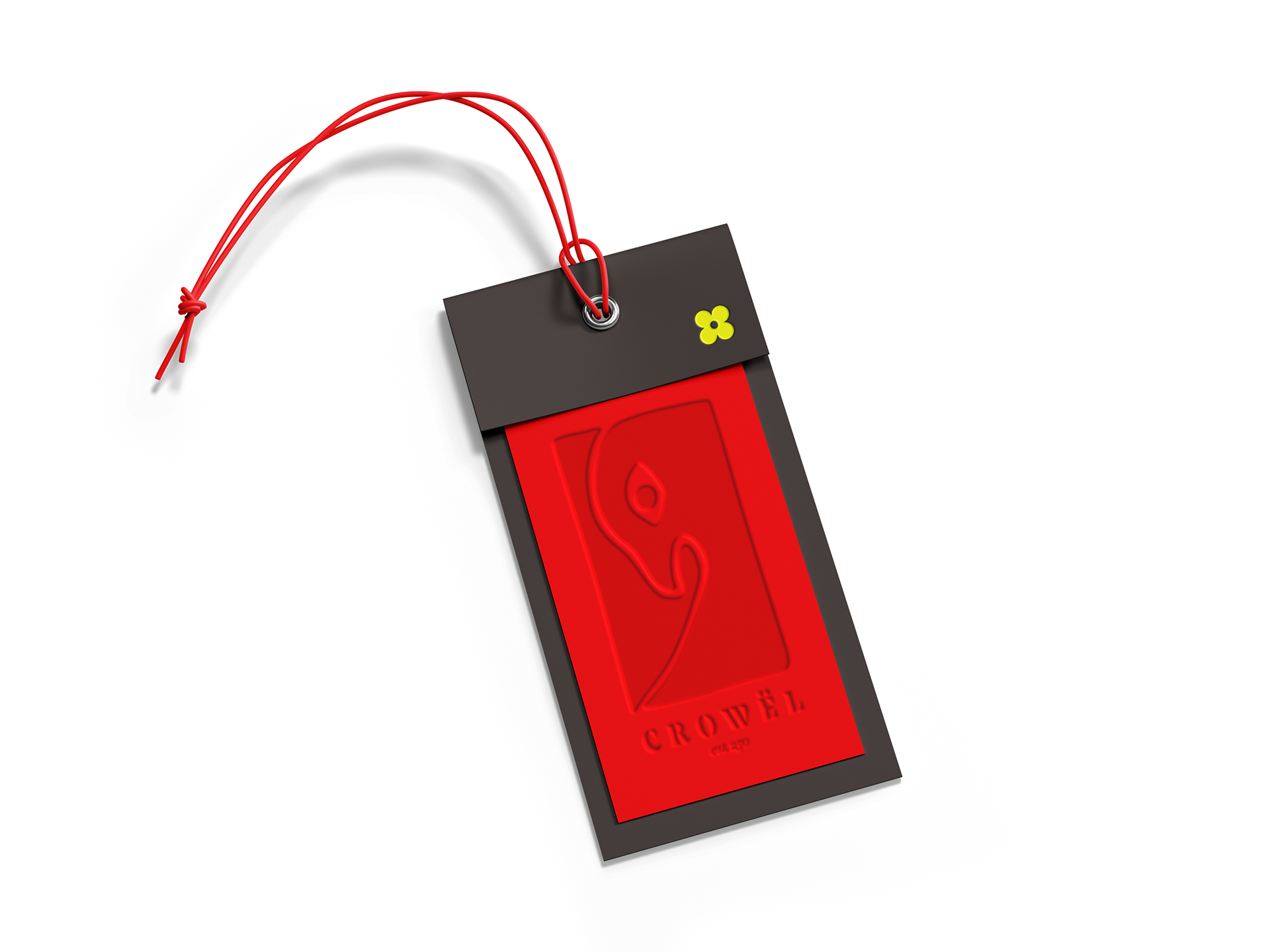
CROWËL was designed based on five initial prompts picked randomly from cards: a clothing store that was formal, high-end, experimental, and futuristic. We started out with lots of brainstorming and brand identity building and end with the final product of a Brand Guidelines Book as well as several mockups to bring the brand to life.


Initial Research
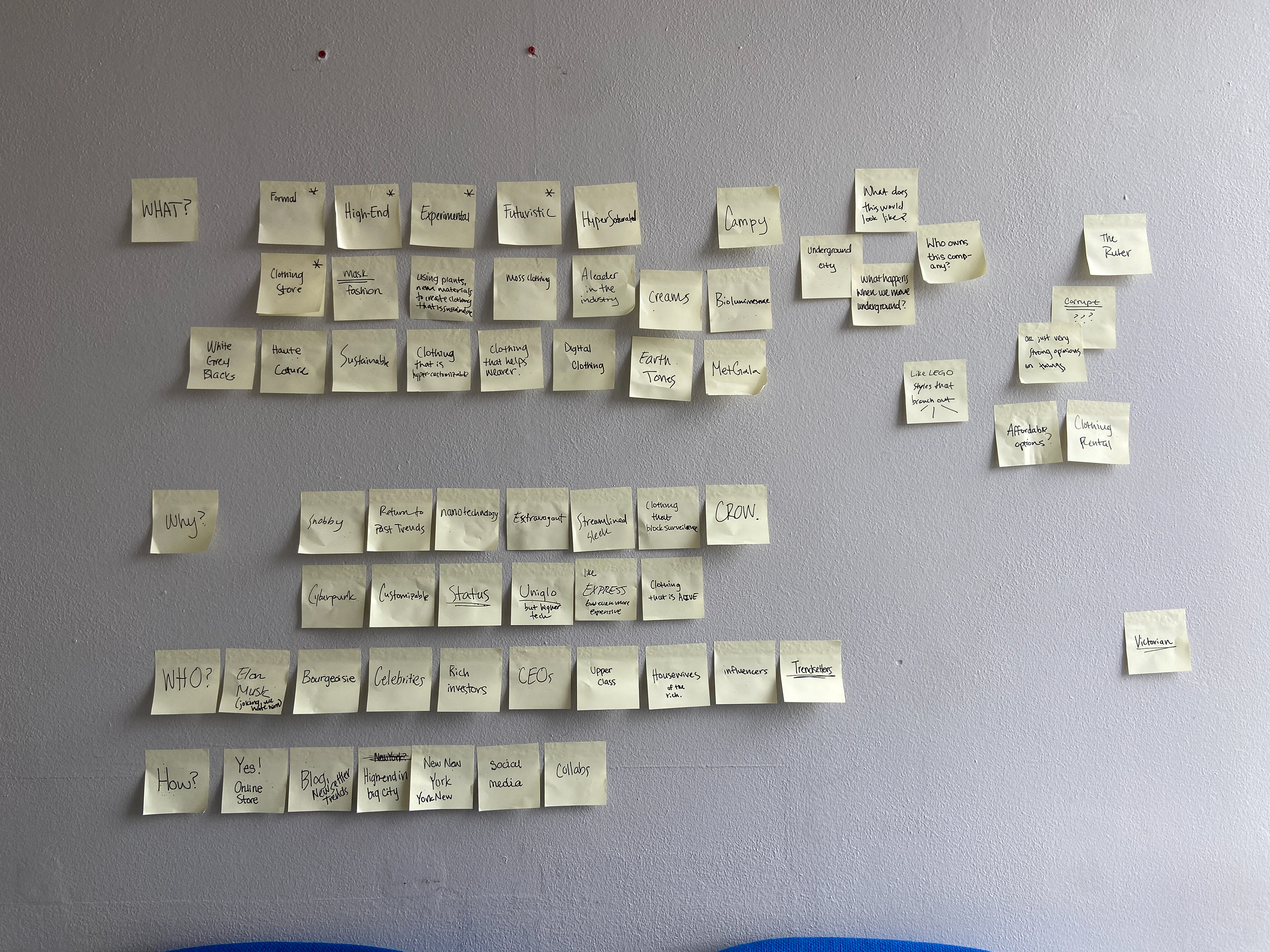
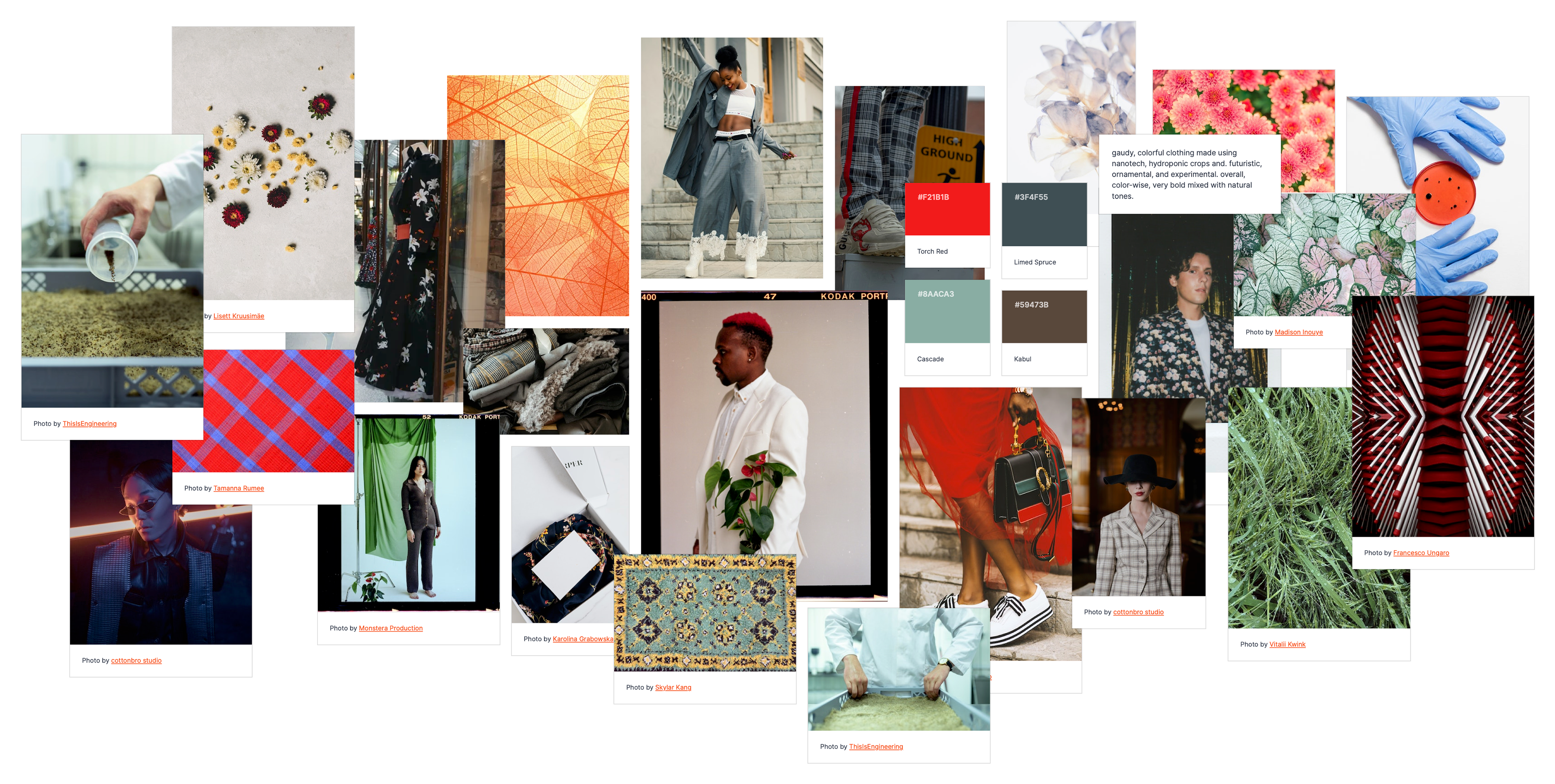
After this, we did sticky note brainstorming for our actual brand, thinking about the name, style, color, location, special features, audience, collaborators, etc. We also made three mood boards, each with a more experimental, far-reaching approach. In addition to this, we conducted a competitor brand analysis.


Design Style Brainstorming: Magazine
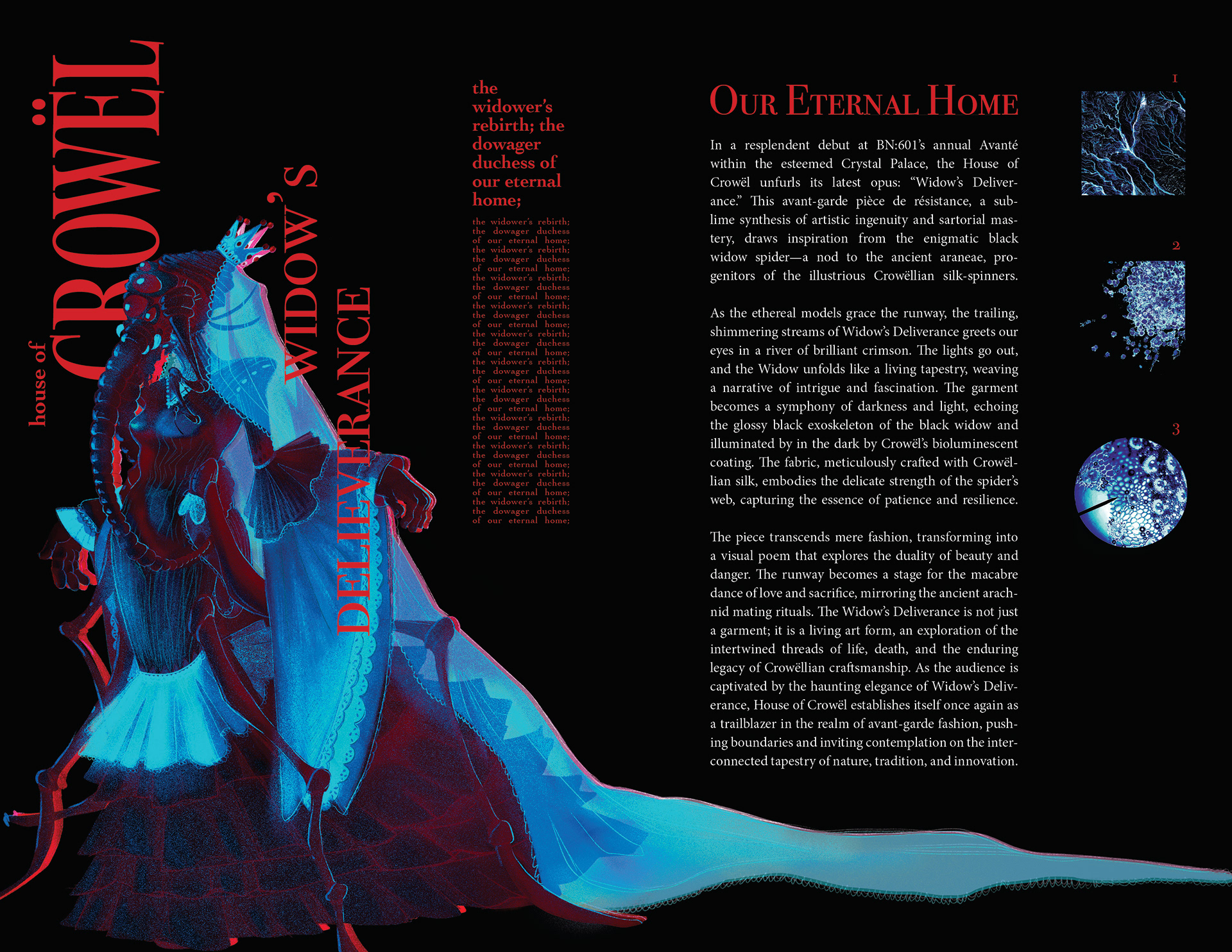
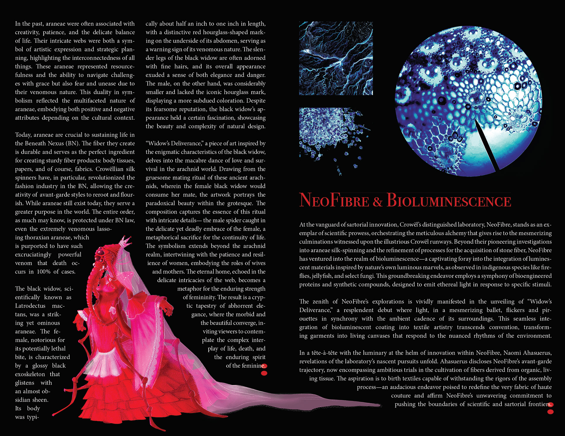
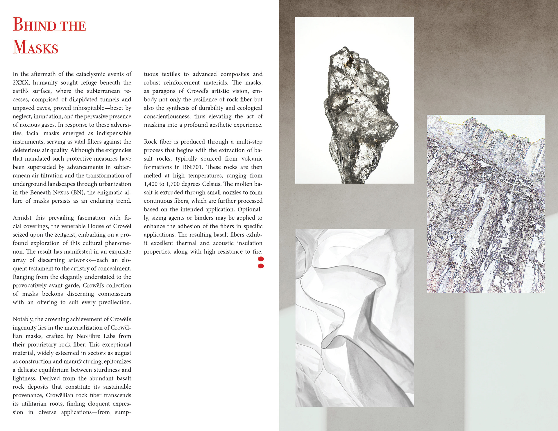
I worked on a magazine layout to get an idea of what the design style for this brand (at this point, I had already decided on CROWËL as a name) would be. I drew a picture of a dress I imagined would be sold by as well as an accompanying mask. The piece, made with the fibers created by Crowëllian Silk-Spinners (fake, special-bred spiders) is inspired by the black widow spider and the species' brutal mating process. It encompasses themes of home, marriage, motherhood, life, survival, death and the beauty of these themes intersections.

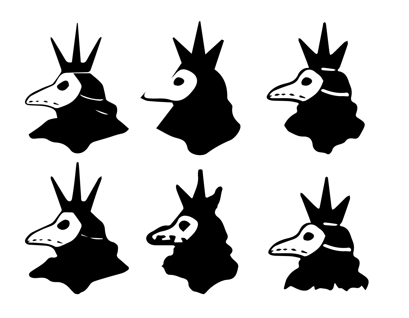
Logo Thumbnails
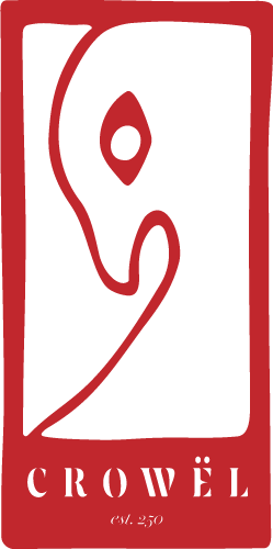
Since CROWËL was based on the word crow, I also wanted to include the bird in the logo. I wanted the logo to convey an unsettling elegance.


Digital Roughs and Refinements
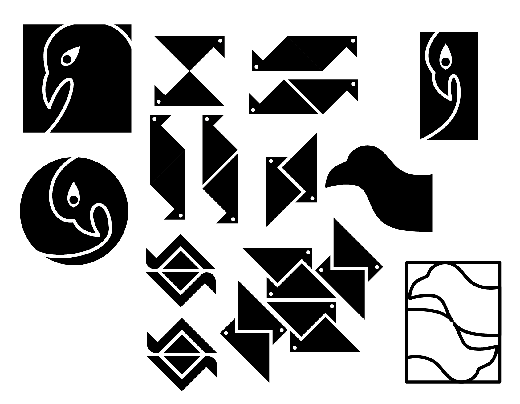
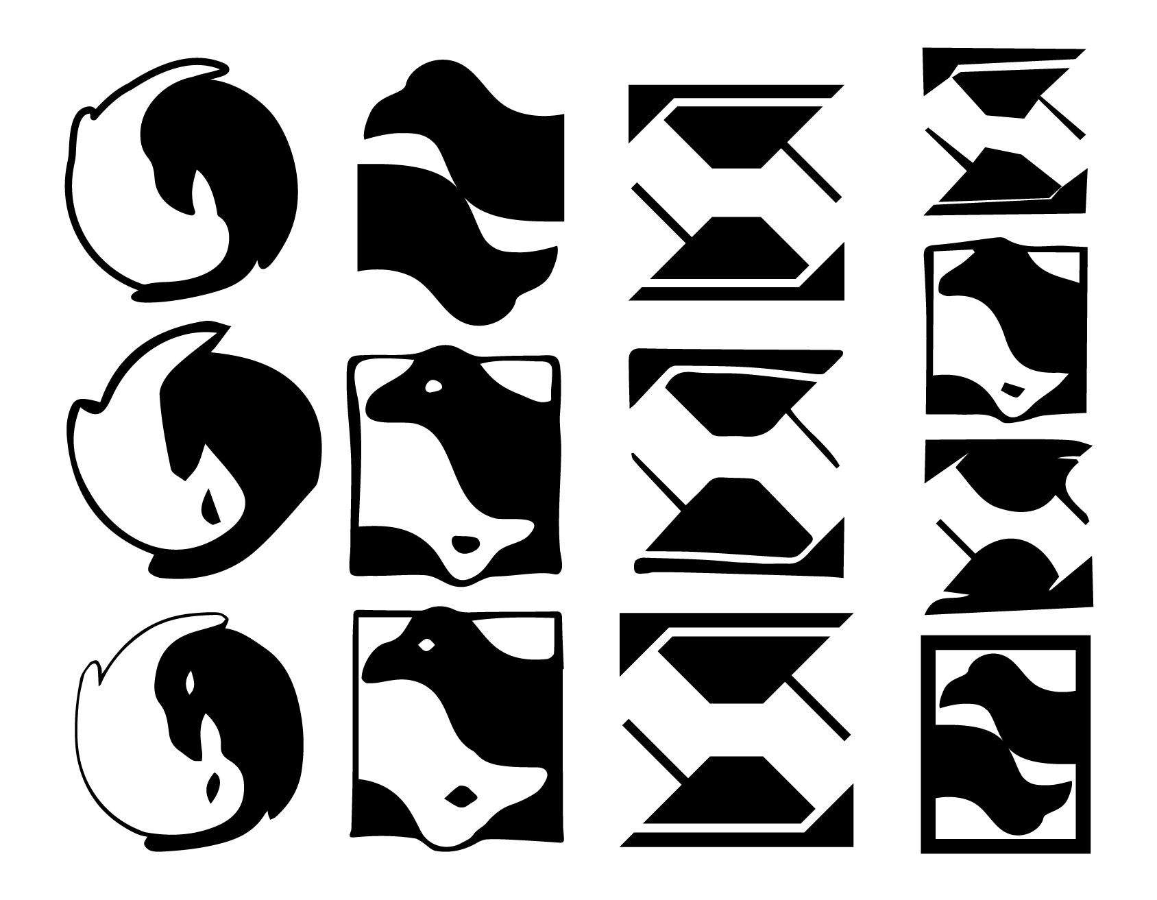

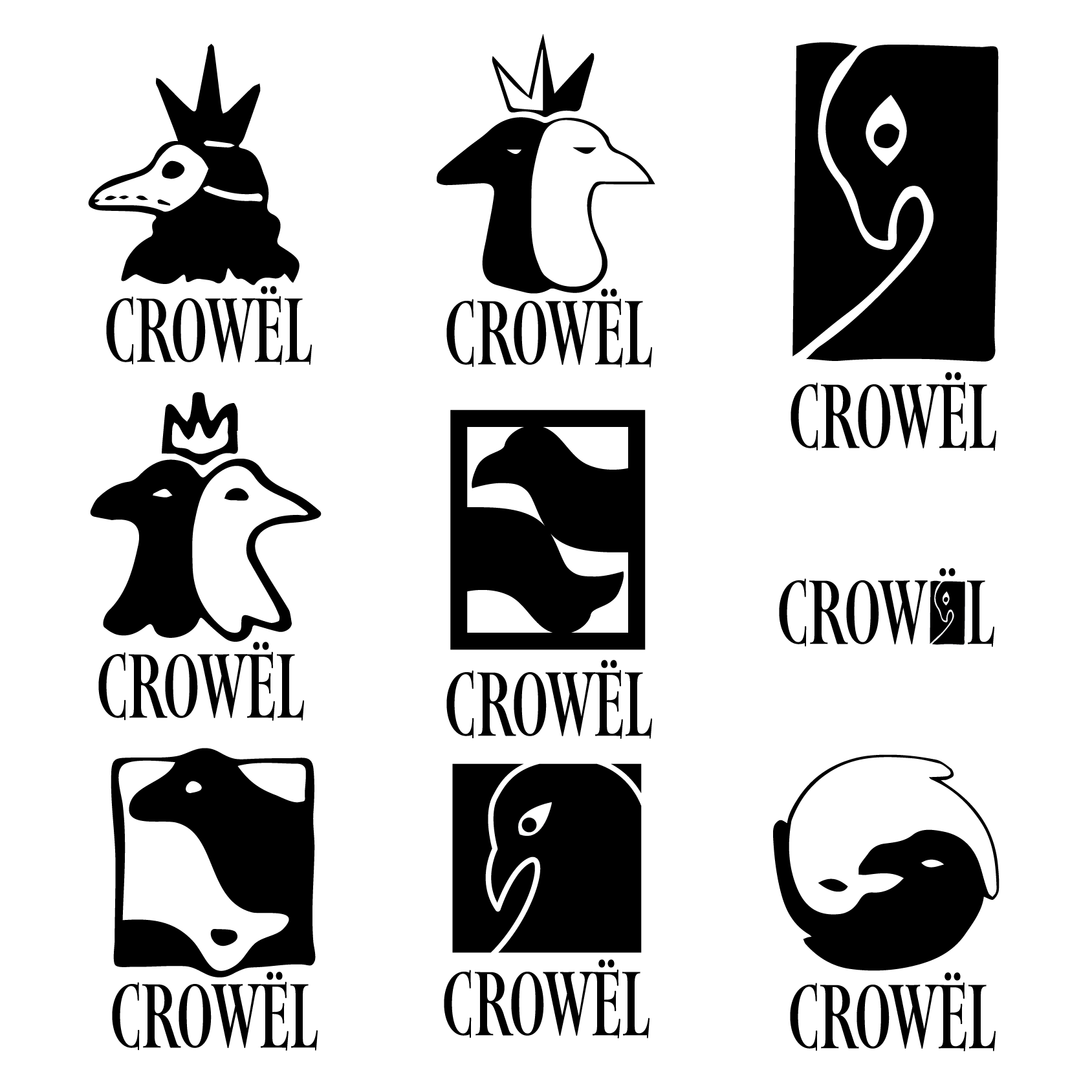
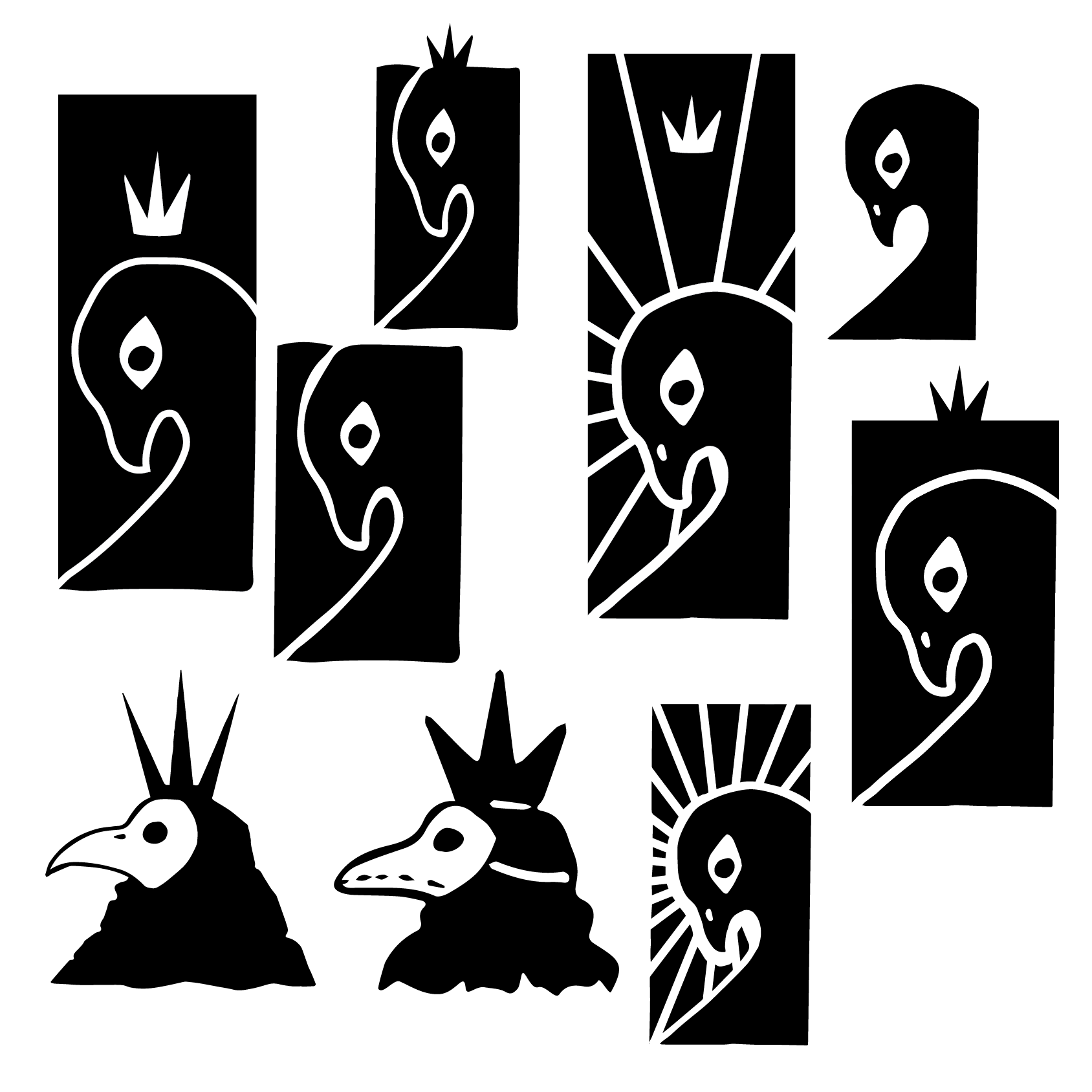


Final Logo
The final logo is finished. There is a bunch more work that happened after this point which you can once again find in the Brand Guidelines Book! You'll also find a more comprehensive look into the brand language of CROWËL.